March 2025
Story
"Women in Architecture" at Harvard University
Built Company Culture
Sky-Frame produces elegant, high-precision sliding doors with extremely fine frames for discerning clients. It was clear from the outset that the new company headquarters had to be suitable in terms of accuracy and rationality and the aesthetic requirements of the products to be manufactured there. Moreover, as is typical for factory buildings, flexibility was a must. The streamlined industrial production processes require ideally neutral halls in order to constantly allow the operating procedures to be optimised via relevant modifications and structural alterations. This is why, even during the architectural competition stage, the project was titled 'Open System. The central idea was an additive system that could expand and evolve horizontally and vertically.
The elaboration of the design relied on listening closely to understand the existing operating procedures and to analyse them with the client. Sky-Frame's company culture is distinguished by pronounced team thinking and flat hierarchies. This meant that during the planning, the complex became more compact and, as a result, more concise and efficient. From now on, everyone would work under a single roof and behind identical facades, use the same staircases and lifts, and meet in the same cafeteria. All the employees are provided with equivalent workplace situations with daylight illumination, and the production halls are designed with the same degree of precision as the offices and the entrance foyer. The result is a lived and built company philosophy, enabling an immersion in the world of Sky-Frame.
Openness and Concentration
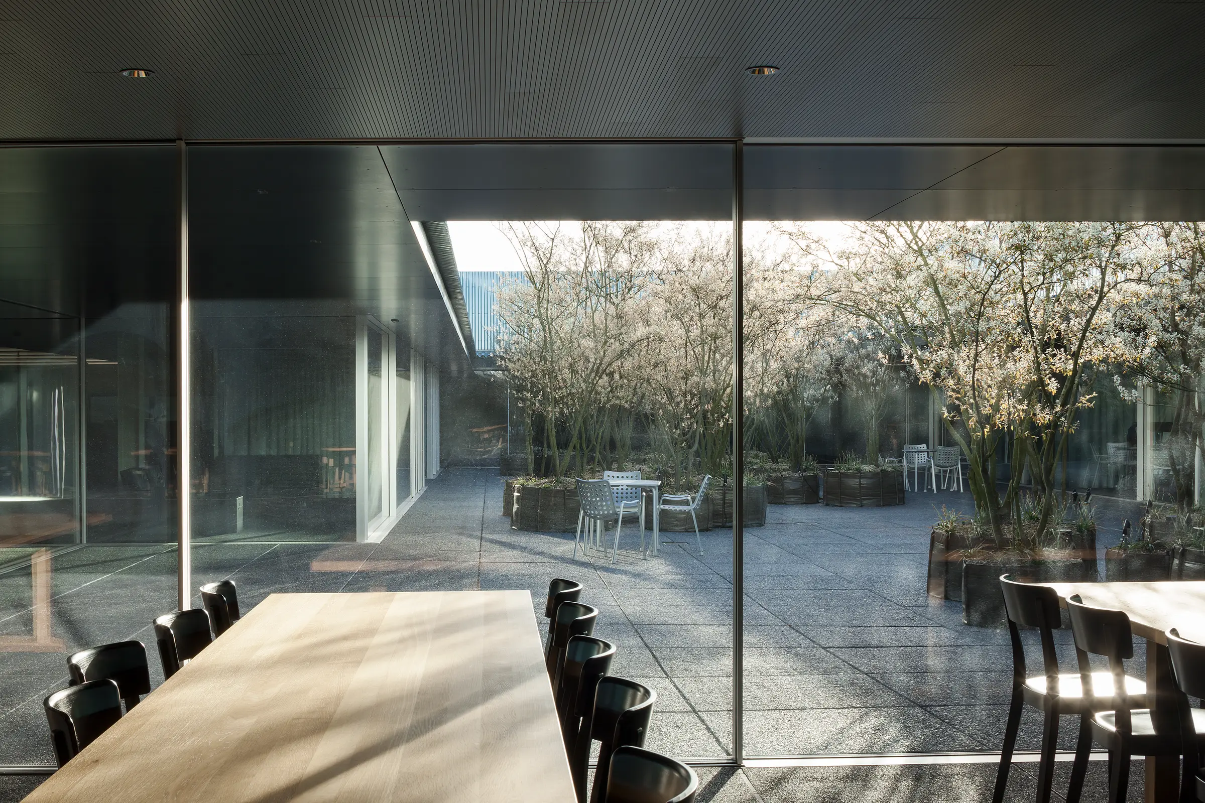
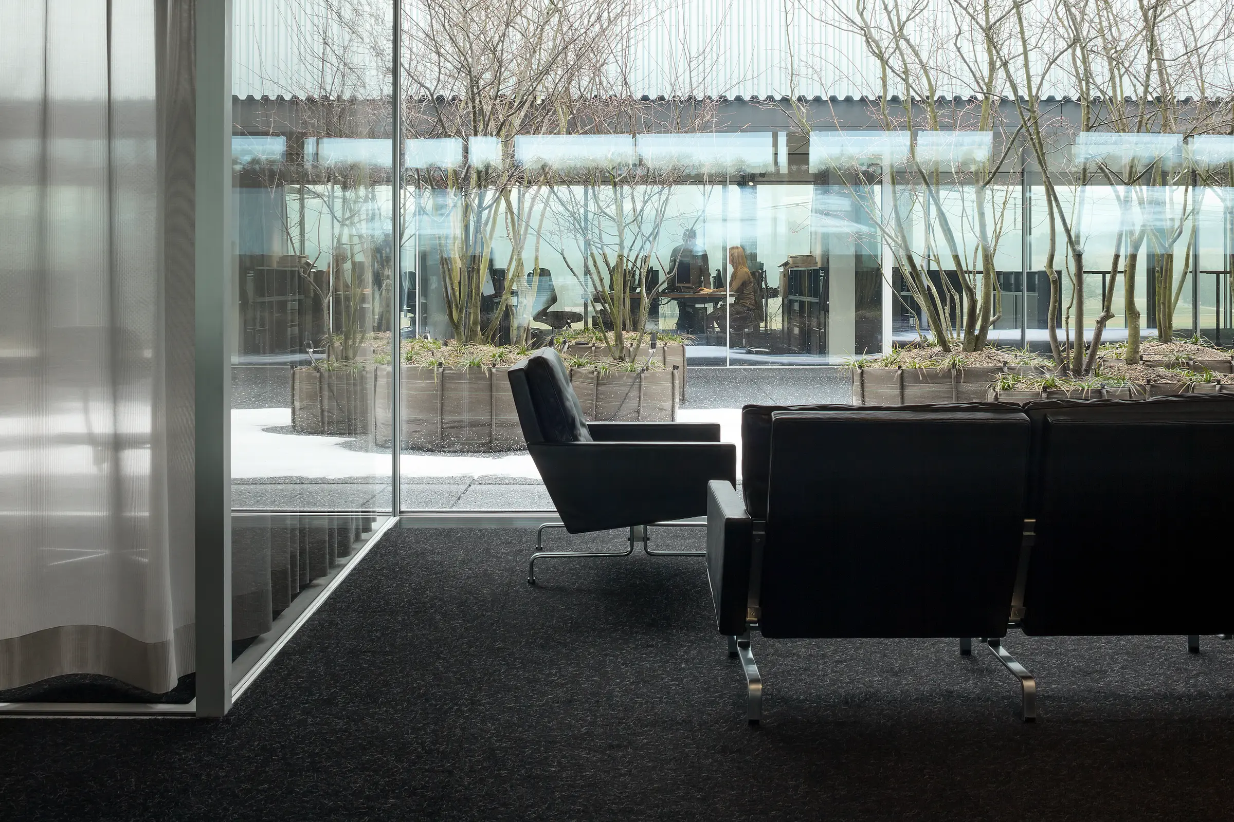
Having arrived and on finally stepping through an almost deliberately unobtrusive door into the reception area, one suddenly finds oneself at the heart of things. Within the open space, the reception forms the conclusion of a series of non-hierarchically arranged work-places. The open-plan office, organised around a peaceful interior courtyard, is coloured in dark tones and is characterised by openness and transparency. Attention converges and focuses inwardly on the courtyard. The centre of activity is a place for contemplation and composure - an oasis of calm in the midst of the everyday hectic, structured by a picturesque group of serviceberry trees.
The canteen is located at the end of the courtyard. This is where all the staff meet during their breaks, and this is also where larger meetings are held. Along the sides, conference rooms and secluded compartments form niches between the interior and the exterior. Nature and the working environment are in terms of each other, mainly as all the walls are made of glass. It is at this juncture - and only here - that the extremely fine Sky-Frame elements are introduced. Around the courtyard, they can be experienced one-on-one - by the customers but also by the staff, who always have the product in their mind's eye and who can feel it in use. In this way, the working environment simultaneously acts as both a test area and a showroom. Thereby, the atmosphere is dominated by elegance and lightness, contrasting excitingly with the raw steel structure of the factory building.
Two Faces
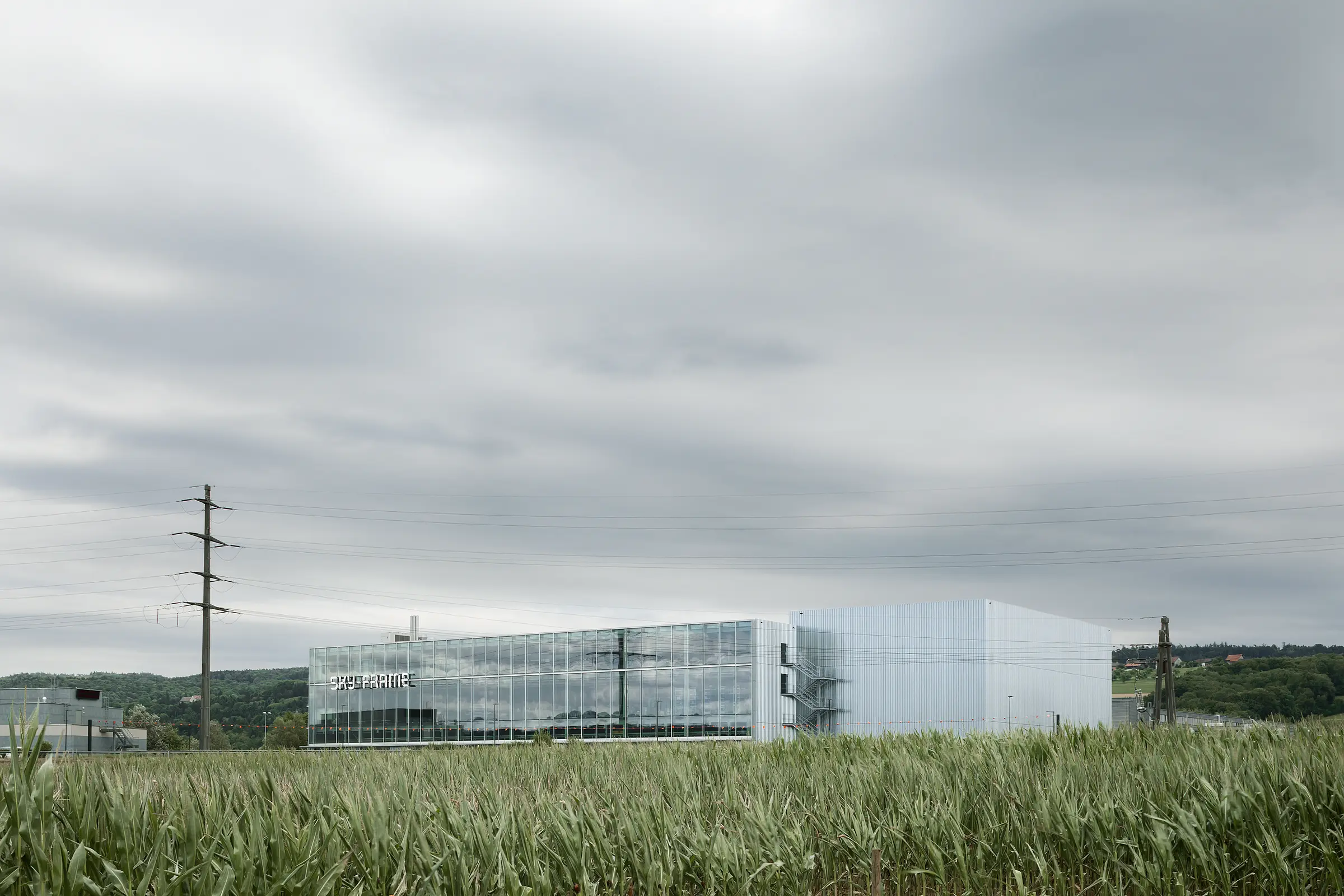
The building is clearly and simply structured. Deliveries, manufacturing, and administration are located one above each other in a compact volume. This is flanked by two access towers wrapped in sheet metal. The larger one, a high-bay warehouse, mainly assists the flow of goods; the smaller one, with a lift and stairs, serves visitors and staff. The forecourt, a land reserve for future systemic building extensions, acts as a spacious entrance road, whilst deliveries and the external warehouse remain hidden from view behind the building.
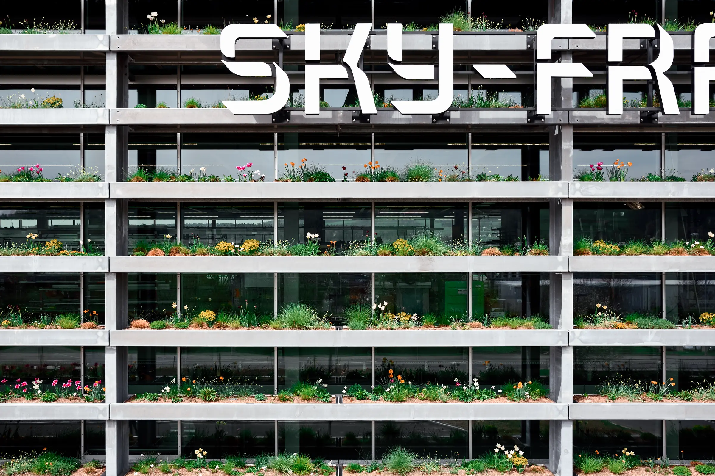
The glazed north facade is entirely transparent. This affords motorists speeding past the building on the motorway a quick, eye-catching glimpse inside. At the same time, an earth embankment conceals the storage space, the bank's undulations producing an appearance of motion. In contrast, the entrance aspect surprises the visitor with a vertical garden. This shrouds the inside of the building, thereby creating a separation, but of a congenial kind. One is attracted to move nearer to the building, only to be afterwards guided along the planted facade to the entrance. In so doing, one encounters the symbiosis of nature and technology in the verdant steel structure up close, experiencing the plants at eye level.
Eventually, one is ushered inside through a simple opening. It becomes evident that the building one is entering is private - by no means a building with which the company wants to trumpet itself to the world. Instead, one is being welcomed into the intrinsic character and the inside of Sky-Frame, but only with having previously been tuned by the architecture. The architects use the term 'converter", a device that mediates between the chaotic outside world of the industrial zone and the world of Sky-Frame, shaped by reduction and precision.
The route from the brightness of the forecourt initially leads through a low entrance into a dim darkness, which lifts again after only a few steps. The visitors' eyes are directed upwards to where indirect light enters from a great height, moulding the high, rough concrete walls. Cantilevers thrust themselves into the vertical space, indicating that the onward route to the destination leads upwards.
Architecture as a Vehicle for Identity
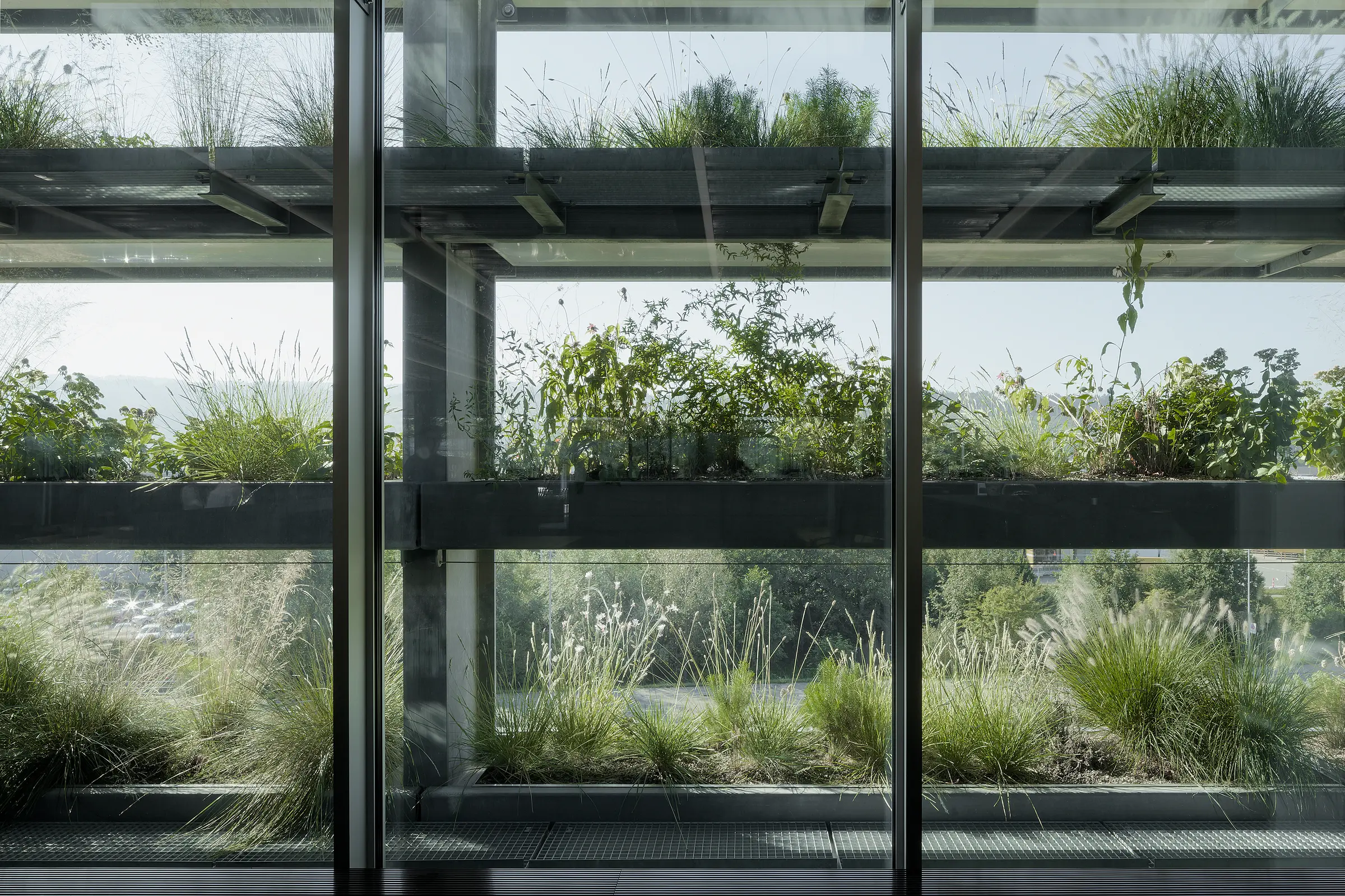
The impression created is of working in a garden pavilion and not high up above a factory hall somewhere between a motorway and an industrial estate - a feeling reinforced by the vegetated south facade. While the view northward wanders freely over the Allmend nature reserve and out into the Thurgau landscape, southwards, it is delineated and framed by the verdant foreground of the hanging garden. In the process, the neighbouring factory buildings are largely hidden from view, whilst the horizontality of the ledges and the tufted plants interact pleasantly with the distant chain of forested hills. During the dark winter months, the sparse vegetation admits greater light, whereas in summer, the dense greenery absorbs the daylight. Acting as if it were a gigantic calendar, the facade allows the seasons to permeate the controlled inner climate of the working areas.
The factory halls benefit from these qualities as well. The delivery areas, the coating workshops on the entrance level, and the profile machining in the middle are designed with the same meticulousness as the office and shared facility storey above. From a special gallery, visitors can peer into the workings of the production levels and the industrial manufacturing processes. The spatial impression is dominated by precision, the controlled light intensity and the open display of the construction, whereby all of the elements, down to the well-organized distribution of the installations, combine to form a striking ensemble. As a so-called partially fitted construction shell, Culture the building appears genuine and robust, promising to age well even under the heavy strain of industrial production, and thus mirroring the quality standards of the company.
Good architecture requires good clients who are prepared to shoulder commitments and think in the long term. Seen from this perspective, a factory building is not simply a production cost factor but rather an active marketing element and, above all, an investment in workplace quality and the promotion of company identity. A good workplace has an inspirational effect, creates confidence and provides a quality of life. By this means, the architecture of the building is able to make a decisive and sustainable contribution to the company culture.
Brise-Soleil
Sky-Frame's aspiration is encapsulated in the catchphrase A view, not a window. In point of fact there are no windows in the building, but instead various different forms of vistas and glimpses. Nevertheless, it is only advisable to dissolve boundaries when that which is vis-à-vis has an appeal. In the case of the industrial estate and its sometimes overly emphatic buildings, this applies to a limited extent, meaning that it is preferential to soften the views of the immediate surroundings. Furthermore, the workplaces require south-facing sun shading and glare protection. The solution to these requirements was the development of a shade-providing layer situated in front of the glass facade.
This brise-soleil was spatially inspired by Oscar Niemeyer's COPAN high-rise in São Paulo. It combines the sensuousness of a vertical garden with the constructive simplicity of a Swiss flower box. These elements extend like lamellae over the entire length of the south facade, creating a unified and horizontally structured perspective.
Concept
The planting of the slats requires minimum upkeep but is still diverse, with the result that they remain attractive all year round. Grasses, hardily structured perennials and delicate, accentuating flowers form a meadow-like vegetation. The light infuses into the building through the fine structure as if through an eyelash, creating a delightful impression when backlit.
Two types of vegetation were evolved for the 13 ledges arranged one above the next. Four levels with a predominance of flowering perennials set accents and vertically structure the facade. The appearance of these colour bands is characterised by plants with a striking habitat and strong flower colours (incl. Echinacea, Lythrum and Sedum). The basic structure of the meadow bands consists of six types of grasses, which, with their differing growth types and their leaf colours, form a finely varying curtain interwoven with the delicate dotted flowers of the accompanying shrubs.
Even in wintertime, the firm, dry stalks and flower heads are highly pleasing to the eye and create an attractive picture with the dew, mist and hoarfrost. In addition, each tray contains a colourful basic mix of various types of geophytes, which already sprout early in the year to produce the first dashes of colour. They constitute the main characteristic of planting well into May when the shrubs and grasses succeed them.
Planting
The vegetation of the brise-soleil is pre-cultivated over six months in plant boxes. The young plantlets are laid out in 1800 numbered pots using coloured slips and then planted by a gardener. During the cultivation phase, the plant boxes were left outdoors and completely exposed to elements but were fed with water and nutrients. Before being mounted, the boxes were planted with 21 types of bulbs, such as daffodils, species of irises and various kinds of tulips.
Technique
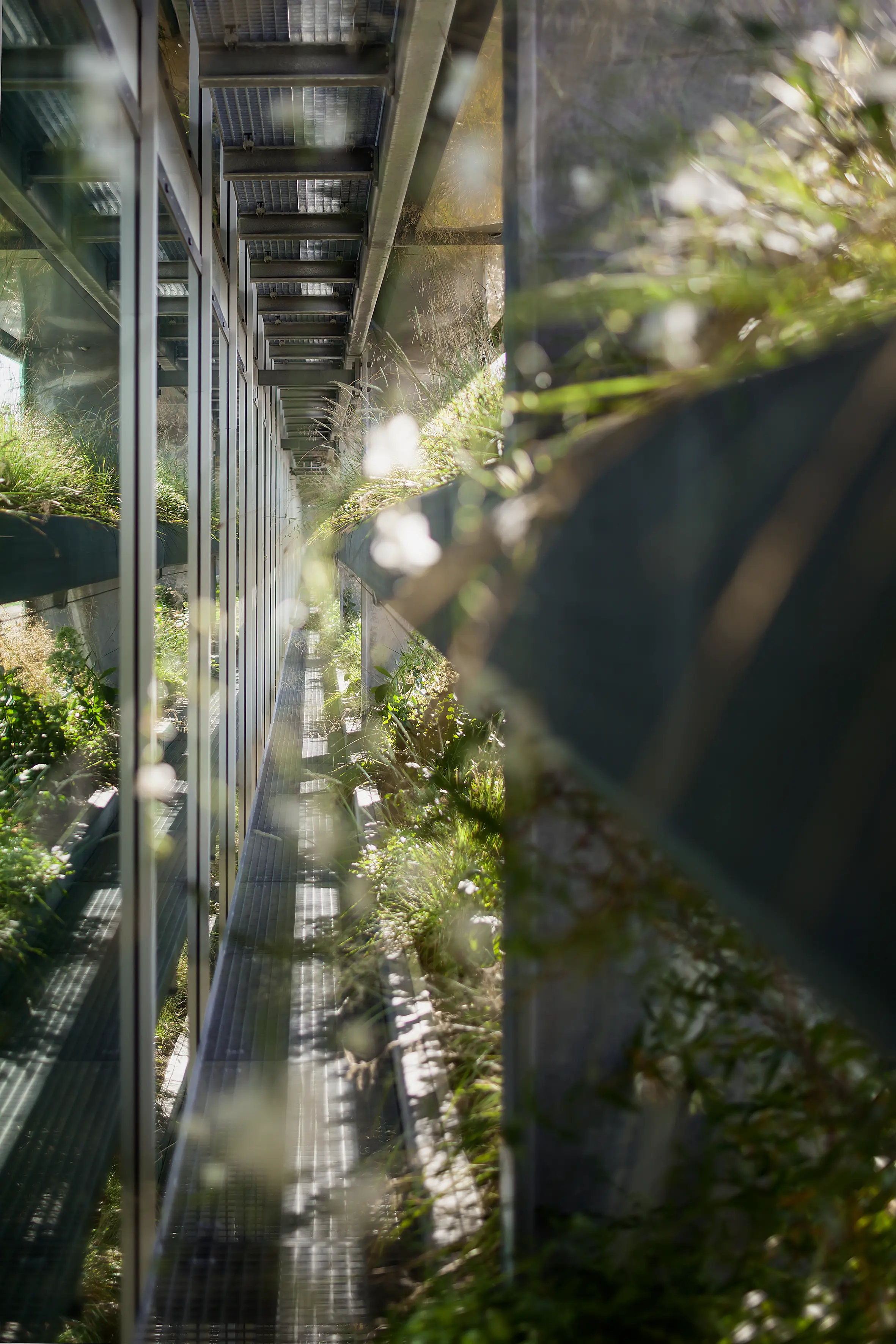
The 13 ledges consist of prefabricated steel basins carried by the load-bearing structure. The vegetation material in these steel containers is transferred to form tiers of extended plant composites, and any remaining gaps are filled with substrate and planted out. The substrate used is purely mineral and is light-weight. It provides good aeration and does not diminish over time.
The water for each level is supplied via a single gully, meaning that the steel basins are laid out absolutely horizontally. A drainage plate on the floor of the basin regulates the water balance of the substrate and drains off excess water. The drainage layer is equipped with an automatically controlled irrigation pipe that supplies the planting with water and, when required, nutrients. Each basin contains a monitoring duct so that the water run-off can be checked. The outlet and the overflow are located at either end of each level, the latter feeding the excess water into the sewage system.
A programme control unit adjusts the water supply by automatically activating and deactivating the low-voltage solenoid valves on each ledge, allowing the irrigation of each level to be individually regulated.