March 2025
Reference
Chalet Face Nord

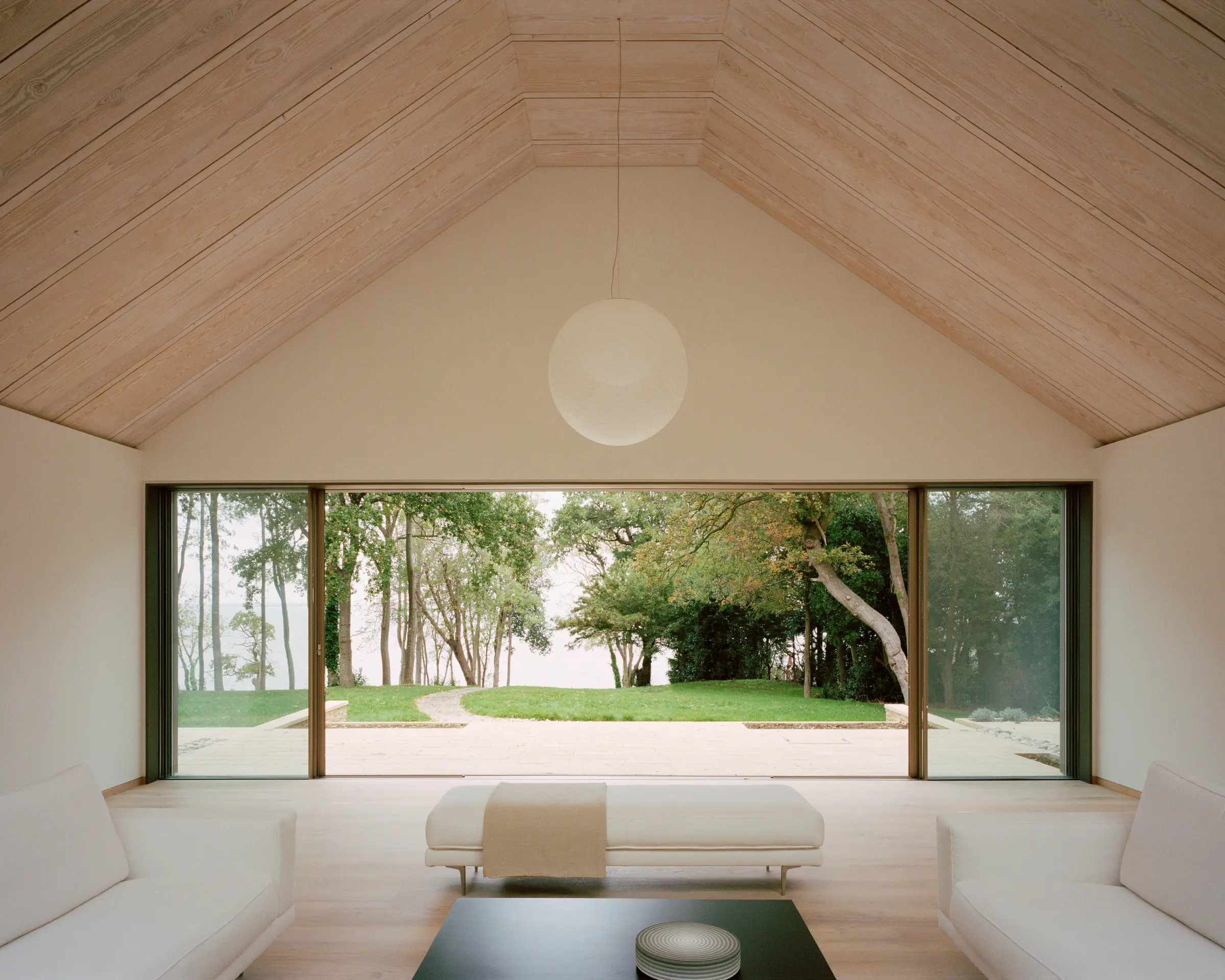
‘Immediately knew that I wanted to work on this project,’ recalls Miya Ushida, who is the founder of the eponymous Miya Ushida Architects. ‘The view of the Solent through the small copse of trees was all it took, to be honest!’
‘During one of the early site visits, we watched from the garden as a large aircraft carrier docked in Portsmouth harbour. It reminded me of the Studio Ghibli film Ponyo – there’s so much activity, from cargo ships to small sailing boats, but the water still gives you a sense of calm, especially at sunset.’

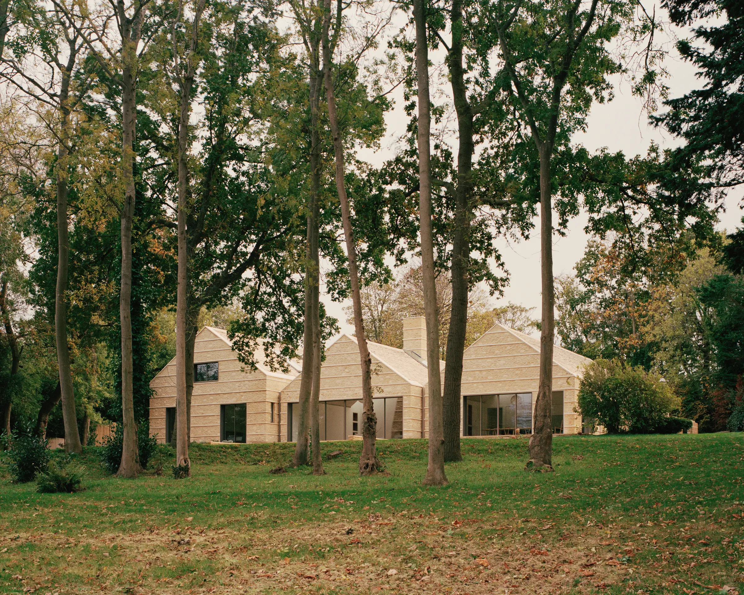
On the north side of the Isle of Wight, in the town of Ryde, this peaceful spot is where Miya has created magic. She got rid of an existing 1980s brick bungalow to make way for a vast, 407-square-metre home, divided into three blocks that each represent the simple outline of a small house.
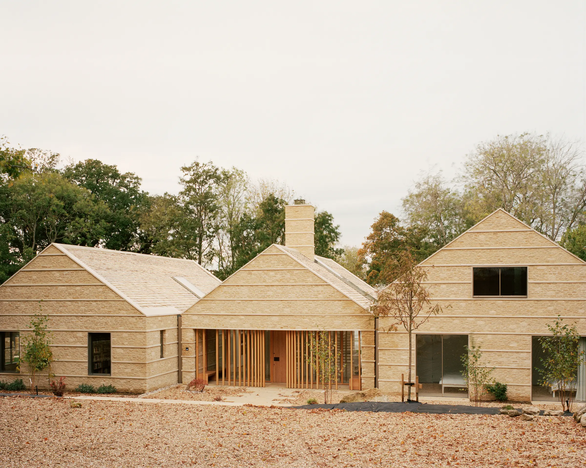
This clever architectural trick is Miya’s way of evoking ‘homeliness’, while allowing space for the grand plans of the owners, a retired couple in their early seventies, who wanted a place that could host three generations of their family at once.
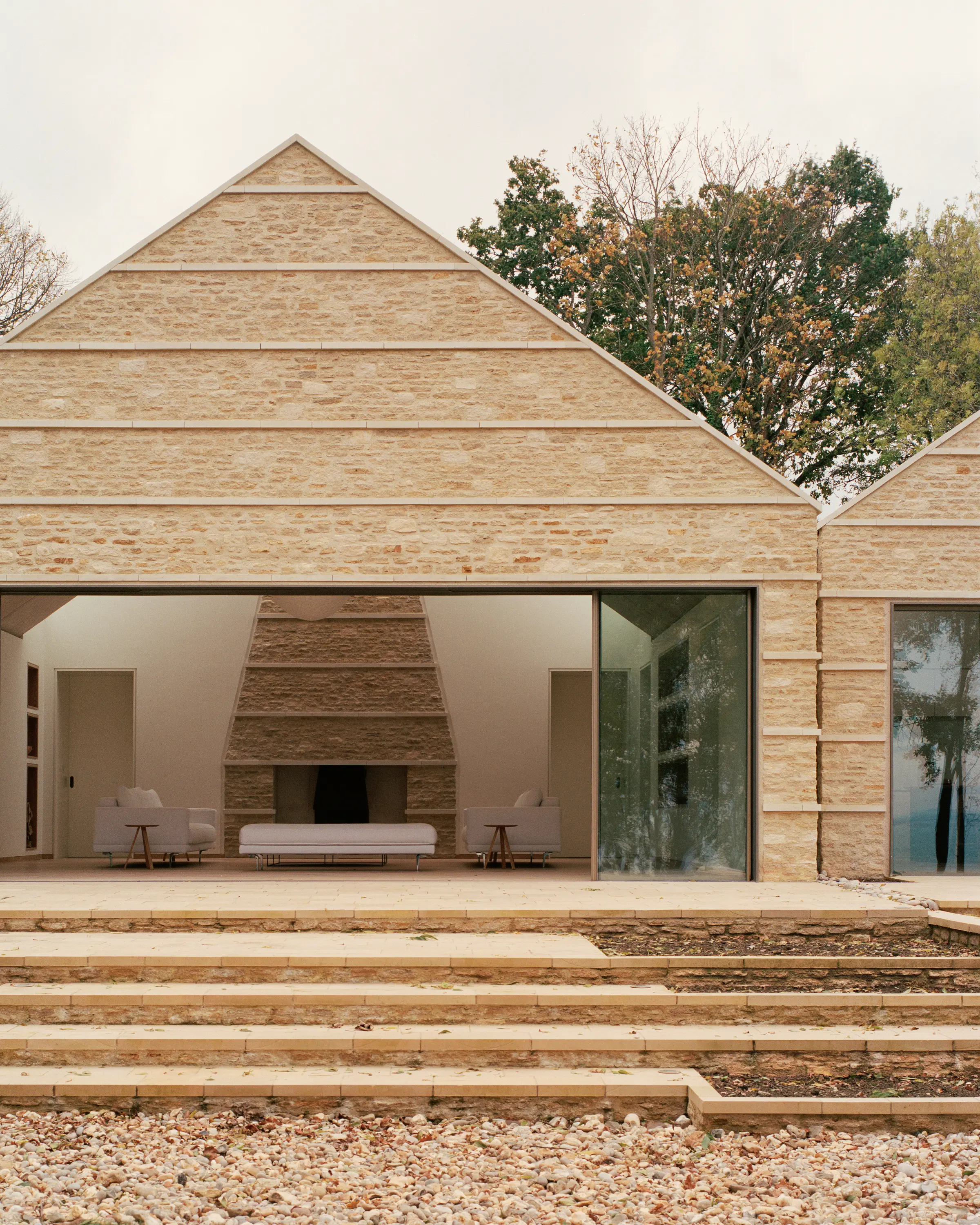
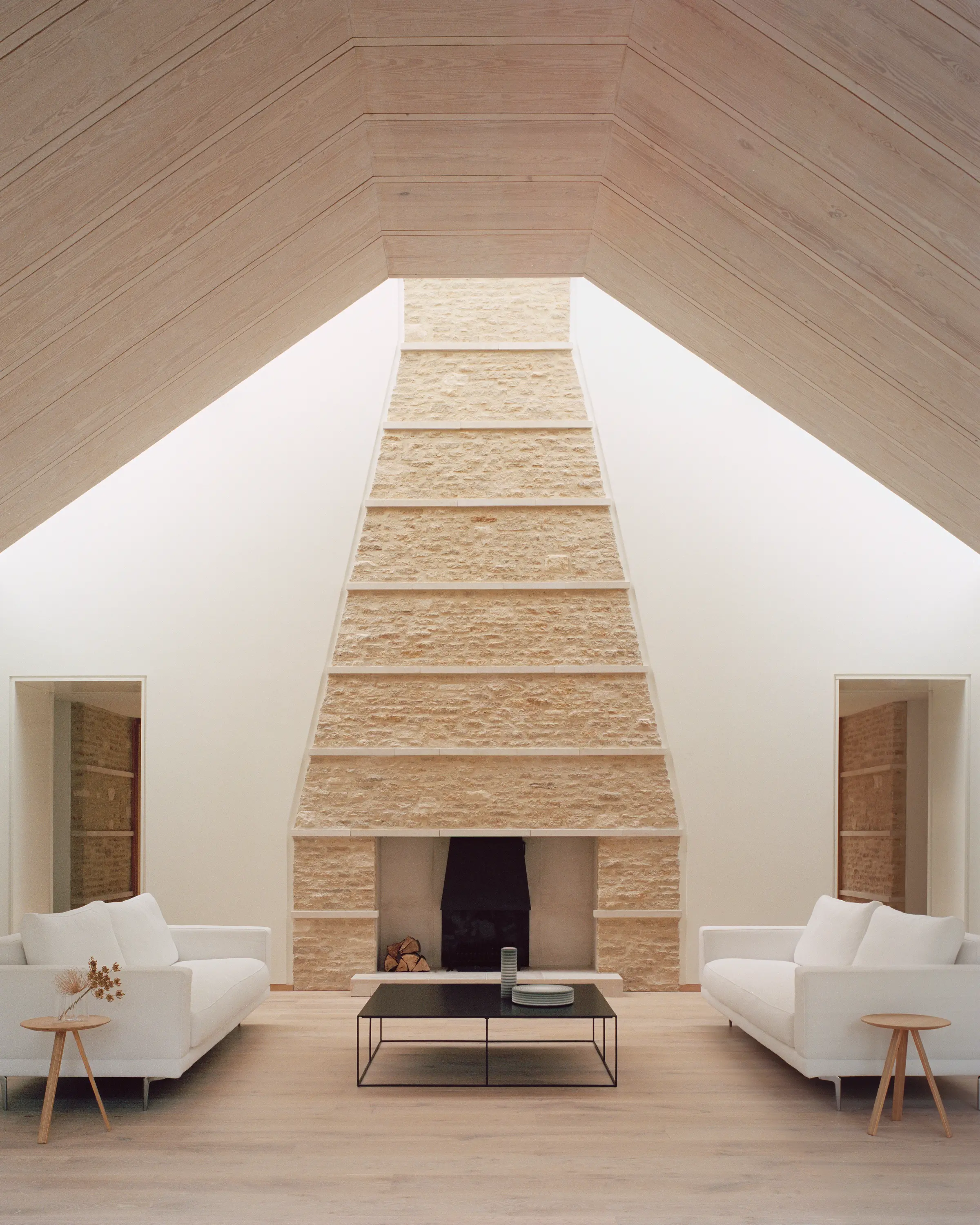
The connected structures are all made from Cotswold stone (chosen to remind the lady of the house of her childhood spent in the region), which is intersected by horizontal bands of Portland stone.
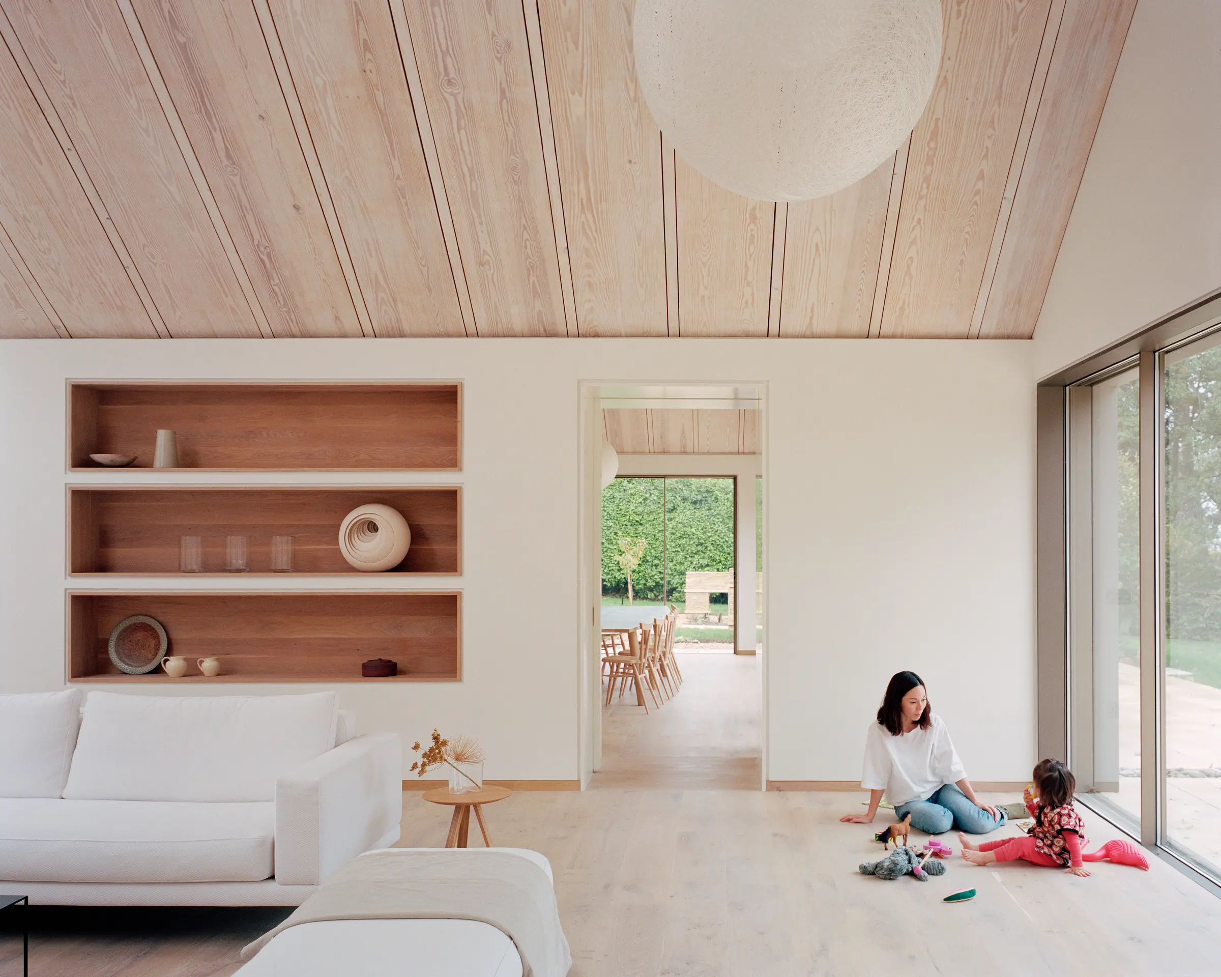
These stripes, says Miya, were intended to ‘contrast the verticality of the copse of trees outside’. Indeed, many of the decisions here were made with the landscape and the view firmly in mind. The entrance hall, for example, was placed in the centre of the house to immediately reveal the view, while the living room’s wall-to-wall windows make the panorama integral to the space.

Neutral tones have been used throughout, allowing the raw materials to shine. It is an approach that is prevalent in Japanese architecture and is particularly important to Miya, who spent some of her formative years in Tokyo.
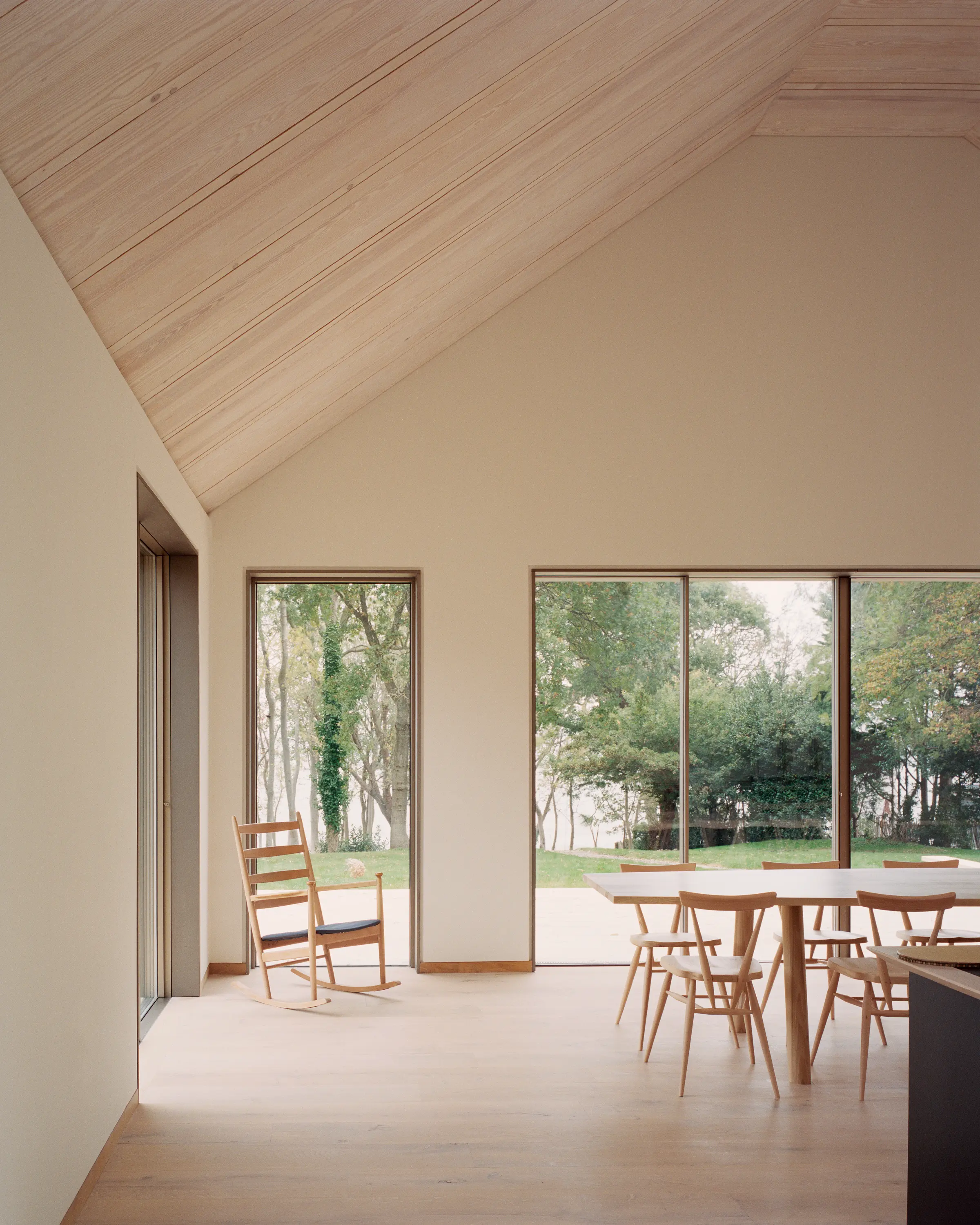
‘It was our intent for the house to be more about natural textures rather than an injection of colour,’ she explains. The only exception to this rule is the kitchen island, painted navy – the homeowners’ favourite colour. Its inky hue is far from a departure from the overall aesthetic, though, bringing to mind shibori, a Japanese tie-dye method.
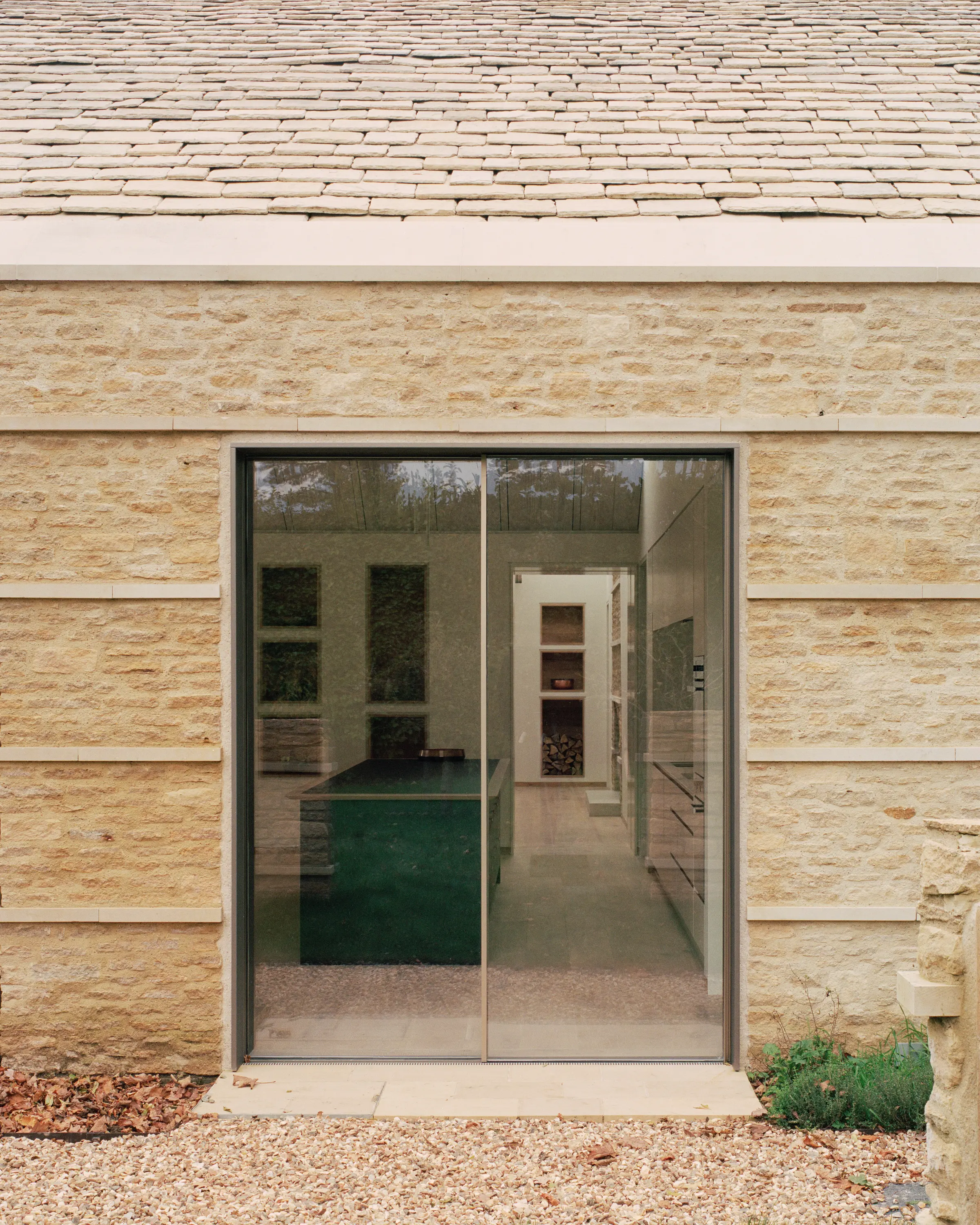
‘There is something about the bold primary forms of the building and its large, carved openings that makes it feel almost like an inhabited ruin, as if it’s something ancient that has always belonged here,’ muses Miya. ‘It is intended to be a place of connections: connection with the view, the landscape and, most importantly, family.’
